Garmin nüvi 360T
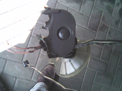
I bought a Garmin nüvi 360T satnav to replace my TomTom ONE v2 which met a somewhat unfortunate demise after I left it "temporarily" on top of my car's engine, forgot about it and drove off. It wasn't long before I noticed the funny smell from behind me but that was long enough to melt the unit's plastic casing and irreparably destroy it.
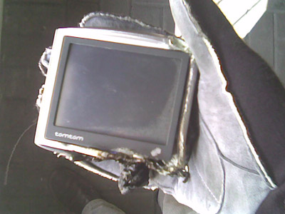
The TomTom was a very good piece of kit. It was intuitive and easy to use yet boasted a number of cool advanced features such as plotting itineraries with multiple stops and planning routes from A to B via C even if you were operating the unit at D.
It did however have a number of niggling problems. The GPS receiver seemed to take forever to update, leading to common situations where I would be advised to take an exit I was already negotiating, and the Teleatlas maps were, to be frank, rubbish. You can forgive a brand new road not being recognised. When you're travelling down a straight road that's been open for several years and the satnav is telling you that you're in a field and should take the next left, it gets a little frustrating.
I decided that the Garmin unit, which had received favourable reviews, couldn't be worse. Although the TomTom is a nice product, if I'm cursing it every time I use it then a change is definitely on the cards. Especially if I've just incinerated the thing.
It isn't fair to make a direct comparison between my old TomTom ONE and the nüvi 360T as the the comparison is not like-for-like. The 360T is more comparable to a TomTom Go 510, offering a hands-free mobile phone kit, an integrated FM traffic receiver and various other goodies. It also comes with maps from Navteq and carries full European coverage. My TomTom only covered the UK whereas the more expensive TomTom ONE Europe also boasts European maps from Navteq.
Keeping these differences in mind, I set out to see how the nüvi stacked up against the TomTom.
The very very first impression of the nüvi was favourable. The first thing you see when you open the box is the unit itself. It's a slim and sleek device and fits neatly into your pocket. Furthermore - although I wouldn't discover this until later - it attaches and detaches from its windscreen mount assembly quickly and easily. If you've ever pulled in at a motorway service station and been faced with the choice of trying to squeeze the TomTom and mount into your pocket or just leaving the damn thing in the car and hoping no one steals it, you'll appreciate the Garmin's design.
Besides the satnav itself there's a fair amount of kit packed into the nüvi box. The obligatory cigarette lighter charger is accompanied by a mains charger (sporting both 2- and 3-pin connectors) , USB cable, FM traffic receiver and manuals in seven languages. The latter aren't really needed; the nüvi's setup menus are straightforward enough.
Having said that I did soon find myself missing the TomTom's UI. Adding, editing and saving routes and locations feels clunky compared to the TomTom and it seems to take a few more taps on the touchscreen to get things done.
For example with the TomTom you can navigate to your home location by clicking the map to open the menu, clicking "Navigate To" at the top left and then "Home" at the top left. Three clicks including what can effectively be thought of as a double click. In comparison the Garmin requires you to click to open the menu, then hit "Where to?" at the top of the screen, "My Locations" at the bottom left and finally "Go Home" at the top. It's one extra press on the touchscreen and your finger has to jump up and down to do it.
I was also unimpressed with the volume of the voices and warning tones. The nüvi is capable of telling you which turn to take and even the name of the road you want, thanks to its Text To Speech software. Unfortunately the TTS voice sounded synthetic and absolutely horrible. I immediately switched to a non-TTS voice in the hope it would sound better. While the regular voice was an improvement I found it vastly inferior to the stock TomTom voices. It also seemed that the nüvi's vocabulary was limited compared to the TomTom's. At one point I found myself leaving the motorway and approaching a roundabout, at which I needed to turn right, in the lefthand (ie wrong) lane because it wasn't until I looked at the screen that I saw the turning. The TomTom would have told me "take the exit then after 100 yards turn right at the roundabout, fourth exit" but the nüvi is much less verbose, saying "Take the roundabout then take the fourth left."
Voice quality scores a big win for the TomTom.
Worse, the nüvi is very quiet. Even at maximum volume I can barely make out what it is saying when I drive at 50mph or faster. I found myself glancing periodically at the "Time to turn" marker on the right of the display, which counts down the distance to the next intersection. The nüvi is telling me that I need to turn after 300 yards but if I can't hear it then I need to look for myself.
The alert that sounds when you approach a speed camera is also quiet, though the fact that it is high pitched and accompanied by a warning message on a bright red background does help to attract your attention.
This might be important because the nüvi doesn't display your speed on the map view when a route is active. If you're just driving around you can see your current speed. If you're following a route, on the other hand, your ETA is shown instead. TomTom manages to fit both stats on to its display as well as the current speed limit, if it knows it, and that is a big plus point.
That said, the nüvi's virtual dashboard, accessible by clicking the speed/ETA section of the screen, is a nifty feature. It hides the map, which is annoying but unavoidable as it does display a decent amount of data. Namely: direction of travel, current speed, distance to destination (if you're following a route), distance travelled, total journey time, total moving time, total stopped time, overall average speed, moving average speed and maximum speed. The counters can be reset and ... enthusiastic ... drivers will want to do so after every journey.
While understandable, the inability to have the map and stats shown together is a sore point. Sadly, this just confirms that the UI simply isn't as nice to use as the TomTom's, which either boasts features that the nüvi plain doesn't have or implements them better. I mentioned before that it takes more taps on the screen to choose a destination with the nüvi. Once you're on your way it takes longer to plan a deviation from your route.
TomTom allows you to "Avoid part of route" whereby you can see a list of all the roads along your journey and pick one to navigate around. Don't fancy the M25 this morning? Pick a detour. In contrast the nüvi only has a Detour button. Press it and you get diverted ... somewhere. You have no way of knowing where you are being diverted to - and how soon, if at all, you will pick your original route back up - short of scrolling through the intersection list one turn at a time. TomTom's route summary is available at any time, not just for planning diversions; the nüvi doesn't have one at all.
The nüvi does make up for this a little with its FM traffic receiver. This works well, showing an alert symbol to indicate that it has updates to the traffic on one of the roads along your route. You click though to get a list of updates, choose the one you want and get more details and the option to avoid the problem. I don't know how good the higher spec TomToms are in this regard as my ONE didn't have a traffic receiver. The Garmin is certainly good.
Another failing of the UI is the insistence on displaying popup messages that you have to click to dismiss. If you thought popup windows obscuring your view of a web browser were annoying, try having your view of your GPS obscured by a message telling you - in case you hadn't noticed - that it is sunset and that the nighttime colour scheme has been activated. And then having to reach across to dismiss this message when you are trying to concentrate on driving. The nüvi will also interrupt you to tell you about speed cameras (if you are watching the dashboard) and incoming phone calls. I found them distracting, annoying and potentially dangerous.
The nüvi isn't without its good points. The ability to select your vehicle, for instance, is nice. Switch it to Pedestrian mode and it will give you a fairly accurate ETA for walking pace. And because it's small enough to carry around in your pocket this is a feature you can actually use rather than just a gimmick. The maps - one of my complaints against the TomTom - are good. I've yet to find myself on a road the Garmin didn't know about. The display is clear and easy to read, even if it would benefit from zooming in when you approach a turning, as TomTom does.
It's by no means a bad piece of kit. If I hadn't used TomTom before I would probably be singing its praises. Unfortunately, although I actually quite like it as a device and will continue to use it, I can't escape the conclusion that it is inferior to the TomTom in almost every way.